الجمعة، 29 يونيو 2018

OnePlus 6 review

nePlus has been so incredibly consistent in its phone releases, particularly since the OnePlus 2, that you kind of get tired of the storyline. It's a flagship-level phone, without the flagship-level price. (The "flagship killer" moniker has all but died, thankfully.) We get it now, that base premise in itself no longer makes OnePlus phones interesting. So it has to actually make a phone that stands alone as something good and exciting, not just one that does most of what the competition does at a lower price.
I've been using the OnePlus 6 for a few weeks now, well after our complete OnePlus 6 review — because on the face of it this looked like yet another OnePlus phone, and I wanted to see whether there was more to it. In many ways, it's more of the same — the tried-and-true OnePlus system is at play here. But with some strategic upgrades and a little more attention to detail, OnePlus has a winner on its hands

OnePlus 6 What I like

The OnePlus 6 is the first phone from the company since the OnePlus X that isn't woefully boring looking. The improved design and materials alone are worth the added cost of the OnePlus 6 compared to the 5T, and that's important — because now that we've crested the $500 barrier, people put real weight behind these non-essential aspects of the phone experience.
Hold the OnePlus 6 next to any $700+ phone and you won't find a difference in quality.
Nobody would hold the OnePlus 6 next to any $700+ phone and point out hardware shortcomings. I sure can't find any issues — and better yet, I think it's really nice. The glass feels modern and expensive, the glossy sides match perfectly, and the whole thing just has a classy ambiance to it. There's still a whole lot of room for OnePlus to go further and really put its own touch on this, but the "Designed by OnePlus" inscription on the back certainly shows that the company is taking this part more seriously.
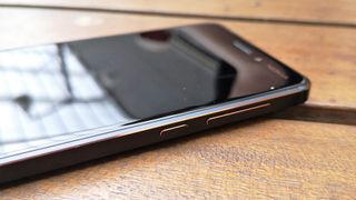
Even with the fresh look, the OnePlus 6 retained one of my favorite parts of its predecessors: simplicity. OnePlus has stayed away from the hardware gimmicks. It has regular buttons in regular places, and they have great tactile response. There's a headphone jack. The always-great Alert Slider is right where you want it. No curved screen or unnecessary hardware buttons or squeeze functionality or "features" to get acquainted with.
The OnePlus 6's software, too, is extremely simple. It also happens to offer a fantastic level of performance I can always count on. OxygenOS flies on the OnePlus 6 — but then again, it did on the OnePlus 5. This has just become a tent pole of OnePlus phones, but it doesn't get old because this isn't a given even on modern phones with comparable specs to the OnePlus 6. Everything is simple, fast and consistent — it's all I ask for from a phone. I don't want extra features and apps and settings, I just want the phone to be a tool for accessing everything I want in my apps and services. The OnePlus 6 delivers, even weeks into my review period, I haven't had a single hiccup, slowdown or crash.
Exceptional software and consistent performance are tent poles of OnePlus phones.
I wish OnePlus would've made another step up in battery size just on principle, but the OnePlus 6 just doesn't need more capacity. I never struggled to make it through a day on a charge, and the only thing that ever got me close was a day that included over two hours of GPS- and data-intensive mapping and listening to podcasts in Android Auto. Through weeks of use, I never felt like I needed to curtail my usage of the OnePlus 6 for fear of battery repercussions later on in the day. And that's all I can really ask for: confidence in the battery.
Ahead of the OnePlus 6 announcement, I made it clear that I wasn't going to give the company a pass on camera performance this time around. With a price bump and even more importance being placed on smartphone cameras, there's no more room for OnePlus to have a good camera "for the money" — it needed to just have a good camera. And it delivered. I'm still disappointed that OnePlus still isn't doing anything particularly interesting with its secondary camera, but it got the main camera right this time around. Moving to a larger sensor, adding OIS and running it all through a better ISP in the Snapdragon 845 elevated the OnePlus 6's camera considerably.
The OnePlus 6's camera is good, really good. In daylight, the shots could pass for those from any top-end phone released in the last year. If you want to nitpick, you can point out it isn't quite as sharp as some, or that the dynamic range when using HDR isn't totally amazing. But it's great, you don't have anything to worry about in daylight. At night, OnePlus made considerable advancement from the generally weak OnePlus 5 camera. This is up to "above average" level in low-light shots, which places it a rung below the cream of the crop — but that's an acceptable shortcoming at this point. Things aren't amazingly sharp in low light, and the white balance can sometimes be off, but these are small problems — most of the time, I liked what I got from the OnePlus 6 in tough shooting conditions.
Is the OnePlus 6's camera is good as the Pixel 2 XL, Galaxy S9+ or Huawei P20? No. But it's getting close, and that's more than good enough for this phone. It feels like the only thing separating OnePlus from the aforementioned group is the thousands of hours and dozens of engineers required to get the computational photography part of the recipe just right. That takes time and money (and often patents) that aren't always easy to come by. But as it stands, the camera is no longer the weak point of the OnePlus phone, and that's an important step. If the next full generation (OnePlus 7, not 6T) makes the same sort of leap in camera performance, OnePlus will be excruciatingly close to the top competition in cameras.
OnePlus 6

A few complaints

OnePlus 6 What's not as good

Now this isn't all just a love-fest. There are still corners that have to be cut (or at least rounded off) at a $529 price, and other areas where OnePlus just hasn't executed properly.
For all of the great components, a few corners had to be cut.
Internally, OnePlus spent money on the components it knows will sell phones to its core customers: processor, memory, storage, and battery. I covered the battery part above, but having the big numbers in the other three categories is important — OnePlus can say it has the same, or better, core specs than the more-expensive competition. But that means that it didn't get to include the "extras" like a fantastic display, advanced speaker system or a full waterproofing rating.
The OnePlus 6's display is good. It's even above average. But it's not up to speed with super-bright daylight conditions, nor does it get quite dark enough at night for my eyes. Colors and viewing angles are good, and there isn't much to complain about here in daily use, but it's these fringe cases that separate "good" from "great" displays. The speaker is as basic as it gets — no attempt at dual speakers, special audio chambers or specific tuning ... and that, too, is disappointing. Every other phone I've used in the last year has a better audio system than the OnePlus 6. And finally yes, I know the OnePlus 6 is pretty much waterproof. But unless OnePlus is willing to do the proper testing and certification to give it an IPX7 rating on the box, I'm not going to trust it — and that's something I have to think about on a regular basis.
The vibration and haptics are just downright bad — there's no way around it.
I've railed on this before, and (thankfully) I know I'm not alone: the vibration and haptics on the OnePlus 6 are just downright bad. Haptic response is one of those things where you aren't supposed to notice it — when done well, it just feels right. When it's done like the OnePlus 6, it's noticeable and completely detracts from the otherwise fantastic experience of using this phone. Every time the phone vibrates, it's rattling, loud and shallow-feeling. There are $250 Motorola phones that have a better grasp of vibration motors. An adjustable vibration setting would at least mitigate the issue — but that wouldn't be able to fix this entirely, it's a hardware problem. I know it seems pedantic, but I really wish OnePlus would've put more thought and development time into the haptics — like the design mentioned above, these are the things people start to care about when the price of the phone goes north of $500.
OnePlus 6

The matter has been settled

OnePlus 6 Second opinion review

If you're willing to spend up to $550 on a phone, but not a penny more, the OnePlus 6 is where your search starts and ends. For this kind of money, you just can't find a better combination of specs, hardware, features, camera, software and performance. It's a great phone that absolutely nails the basics, but also goes beyond your expectations in many other ways.
If your budget caps out at $550, the OnePlus 6 is where your search starts and ends.
OnePlus was likely going to keep holding that "best phone for the money" moniker if it simply refreshed the OnePlus 5 again. But with this improved design, better camera and a bit more attention to detail it has also managed to wiggle its way up into being a credible direct competitor to the more expensive competition. Aside from a few minimal issues, the OnePlus 6 faithfully competes with top-end phones from other companies — and at the same time, its software experience and performance matches or outdoes every other phone out there.
There are better phones if money is no option. And there are better "values" to be had in less expensive phones that still do much of what the OnePlus 6 does. But in this pricing sweet spot, I see no other competition — this phone is the winner.


الخميس، 28 يونيو 2018

Acer Predator Helios 300 review

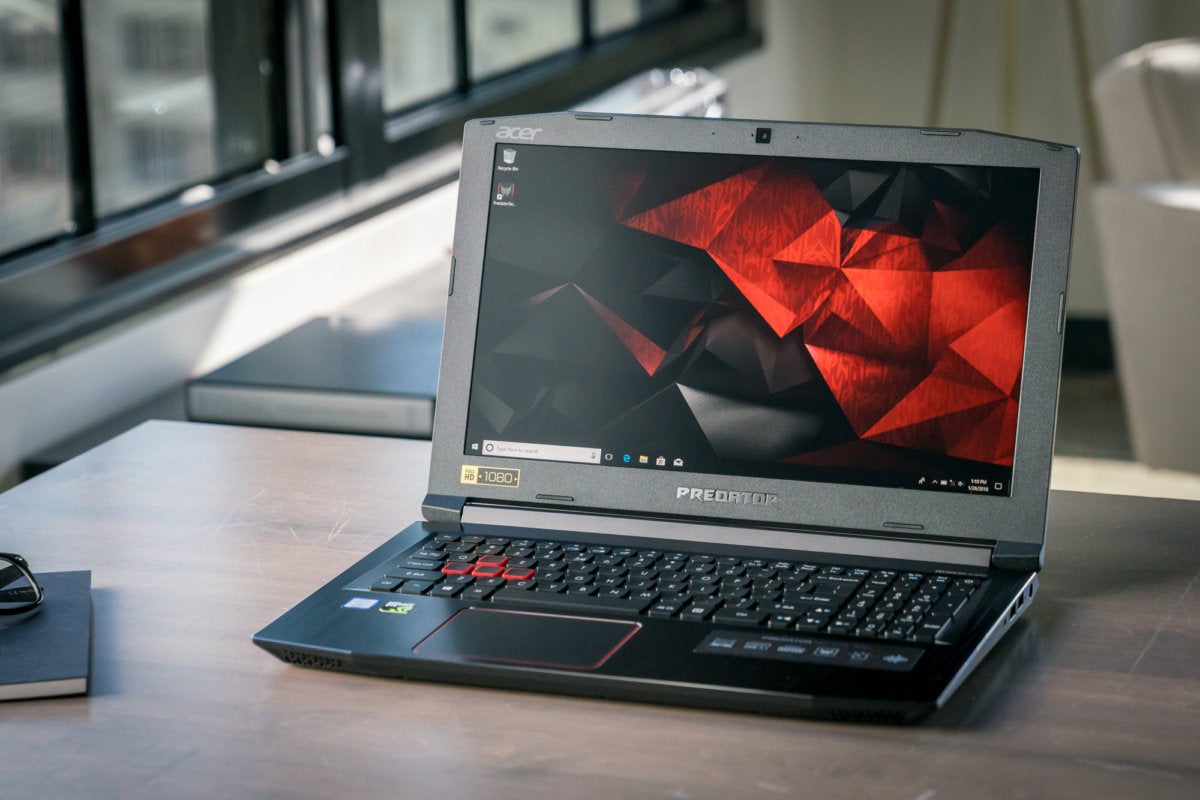
With the monstrous Predator 21 X and sleek Predator Triton 700, Acer staked a compelling claim on the high-end market, loading its notebooks with extravagant features and the most powerful portable gaming hardware available. The Acer Predator Helios 300 doesn’t concern itself with fanciful bells and whistles. It’s a straightforward, no-nonsense gaming laptop that delivers a refreshing amount of bang for your buck, starting at $1,100 on Amazon with a Core i7-7700HQ processor and a GeForce GTX 1060 graphics card.
The Acer Predator Helios 300 isn’t quite perfect. The display runs dimmer than its rivals, and the storage is cramped. But beyond those minor grumbles, this machine checks all the boxes you could ask for in an affordable gaming laptop. It’s even easy to repair!

Acer Predator Helios 300 specs, features, and price

Acer offers the Predator Helios 300 in several configurations spanning both 15.6-inch and 17.3-inch display sizes. We’re reviewing the entry-level 15-inch version. Here’s what’s inside:

  • CPU: Core i7-7700HQ
  • GPU: Nvidia GeForce GTX 1060 6GB
  • RAM: 16GB DDR4/2400
  • Storage: 256GB M.2 SSD
  • Wireless: 802.11ac Wi-Fi
  • Display: 15.6-inch 1920x1080 60Hz IPS
  • Ports: 2x USB 2.0, 1x USB 3.0, 1x USB 3.1 Type-C, HDMI, SD card reader, ethernet, headphone jack, lock slot
  • Weight: 5 pounds, 7.9 ounces, or 7 pounds with power brick
  • Dimensions: 15.4 x 10.5 x 1.1 inches
  • Webcam: 720p
  • Price: $1,100
Around this price range, you’ll normally find gaming laptops equipped with a lesser-powered GeForce GTX 1050 or GTX 1050 Ti graphics card, or a middling Core i5 CPU. Not here: The Predator packs the same quad-core Core i7-7700HQ processor found in laptops that cost two or three times more, along with a full-fat 6GB GeForce GTX 1060—no dialed-back Max-Q version here. Despite the affordable price, Acer didn’t skimp on the memory, stocking the Helios 300 with 16GB of DDR4 RAM
The only ho-hum hardware? Storage. This entry-level configuration includes an SSD with a scant 256GB capacity that’ll fill up fast in this era of plus-sized games. It’s nice and fast in practice, though. Acer offers another configuration that supplements the SSD with a 1TB mechanical hard drive, but at a steep $300 premium. Given how easy it is to crack open the Predator Helios 300—the empty hard drive bay is secured shut by a single Phillips screw—I’d recommend going the DIY route to add more storage to the laptop.
acer predator helios 300 3


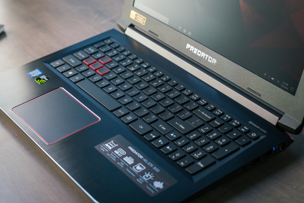
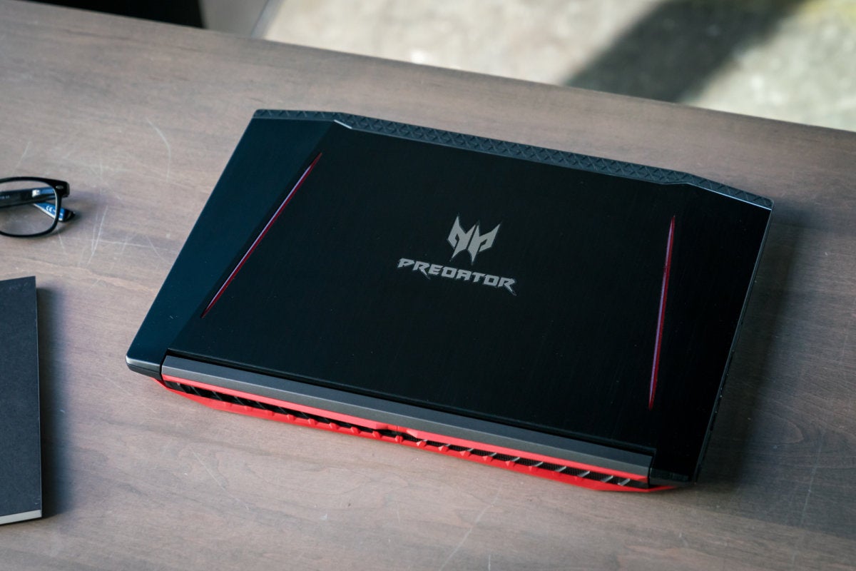
The laptop chassis includes plenty of plastic, as you’d expect in a gaming notebook in this price range, but Acer augments it with a sleek, brushed-metal lid and keyboard deck. Two angled red stripes flank the Predator logo on the lid, ensuring everyone in the coffee shop knows you’re using an Acer. It’s a fingerprint magnet, though. With 5 pounds, 7.9 ounces of heft and a 1.1-inch thickness, the Helios 300 is fairly compact for a gaming rig. You’ll feel it in your backpack but won’t break your spine lugging it around.
acer predator helios 300 2

The inputs feel comfortable and responsive, too. The chiclet-style keys have plenty of travel and aren’t overly loud in use. Fetching red backlights augment the keyboard and look nice against the black keys. They can be turned on or off manually, but not dimmed or customized on a per-key basis. The clickpad-style touchpad handles very smoothly and accurately. I’d have preferred dedicated left- and right-click buttons, but hey, I’m a purist. The Helios 300’s keyboard and touchpad excel overall.
I wish I could say the same for the 1920x1080 IPS display. It’s nice and sharp with wide viewing angles, but far too dim. In fact, at 230 nits maximum, it doesn’t even hit the minimum brightness level we use for our battery run-down tests, which run at a standardized 250 to 260 nits to simulate comfortable indoor viewing. Some colors lack pop and feel washed-out as a result, especially vibrant hues. Don’t get me wrong: The Predator Helios 300’s display is serviceable overall. It’s just lackluster compared to rival screens.


acer predator helios 300 4

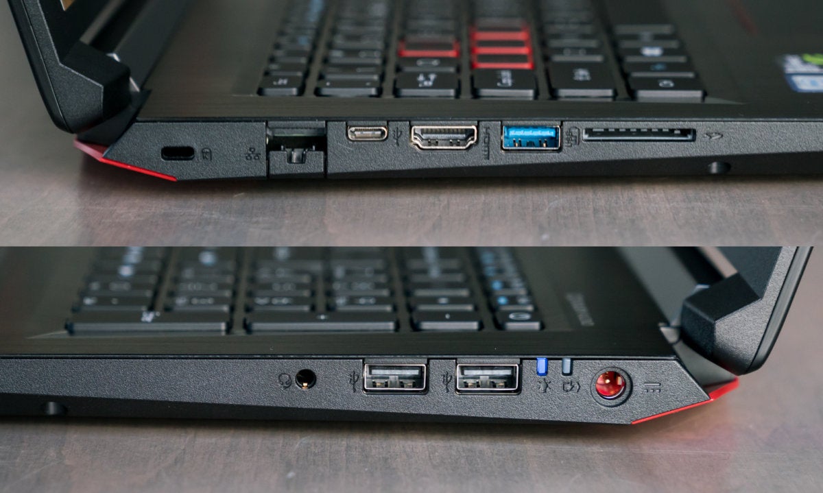
Here's a look at the laptop's port selection. The USB 3.1 Type-C port is a nice touch that you normally don't see in this price bracket.
Acer Predator Helios 300 performance
The Acer Predator Helios 300 packs an awful lot of punch for its price. We’ll be comparing it against several similar systems in our tests, including the $950, GTX 1060 Max-Q-equipped Dell Inspiron 15 7000 Gaming, the thin-and-light, $2,200 Gigabyte Aero 15X with a GTX 1070 Max-Q, and the $1,250 Microcenter PowerSpec 1510 with a full-fat GTX 1070.
helios 300 cinebench

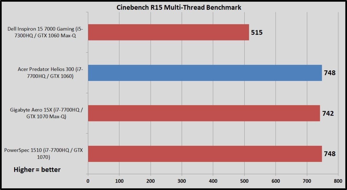
Maxon’s Cinebench R15 measures raw CPU performance, and will happily use as many threads as you can throw at it. All of the gaming laptops being compared today use the quad-core Intel Core i7-7700HQ except the Dell Inspiron, which uses a Core i5 chip instead. Because the chip lacks hyper-threading support, Dell’s laptop brings up the rear in Cinebench’s multi-threaded benchmark by a large margin. The others deliver virtually identical performance results.
helios 300 handbrake

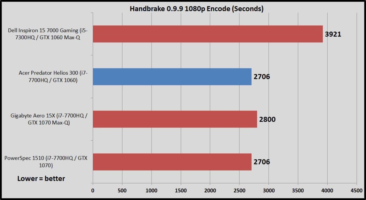
But Cinebench’s benchmark runs in a short duration. The file we encode in our CPU-intensive HandBrake test (which uses an older version of the software) takes around 45 minutes on a quad-core processor. The extended duration reveals how a laptop’s temperature throttling affects performance over time. Once again, the Core i7-7700HQ laptops turn in similar results, with the Core i5-equipped Dell Inspiron lagging far behind.
helios 300 firestrike

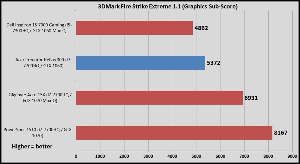
Gaming laptops need strong graphics capabilities, of course. We test their visual chops using the Graphics sub-score in 3DMark’s Fire Strike Extreme benchmark, a synthetic benchmark that focuses on pure GPU performance. This test illustrates how Nvidia’s efficient Max-Q GPUs achieve their energy savings in part by dialing back performance. Again: The Inspiron has a GTX 1060 Max-Q, the Predator Helios 300 being reviewed packs a full GTX 1060, the Gigabyte Aero 15X holds a GTX 1070 Max-Q, and the chunky PowerSpec laptop keeps the pedal to the medal with a full-fat GTX 1070.
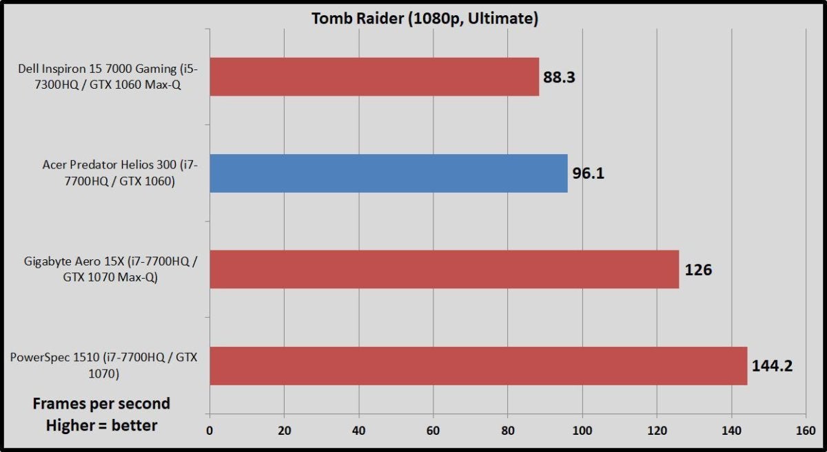
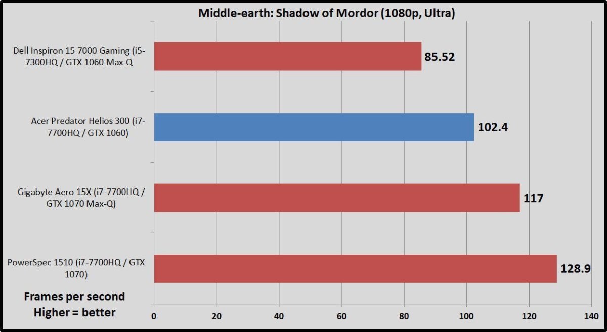
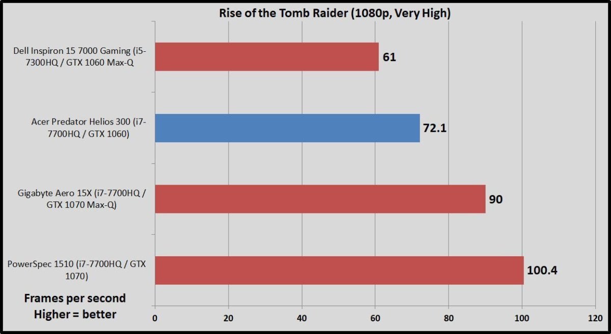
But enough synthetic benchmarks. Let’s get to the games! We compare laptop gaming performance at 1080p resolution to standardize results across the board, using the in-game benchmarks included with each title.
helios 300 tomb raider
helios 300 mordor
helios 300 rotr
The GTX 1060 inside the Predator Helios 300 excels at this resolution, with frame rates surpassing display’s 60Hz speed across the board. These gaming results once again show the difference with Max-Q versions of Nvidia’s GPUs. The full-blown GTX 1060 is solidly ahead of the Max-Q variant in the Dell Inspiron. Moving up to a GTX 1070 provides a big jump in performance as you’d expect, with the GTX 1070 Max-Q splitting the difference.
We also ran the Rise of the Tomb Raider benchmark continuously for an hour, and the only performance drop-off observed fell within the margin of error—around a frame per second. The Acer Predator Helios 300’s cooling does its job, and it does so without being overly loud. This is a gaming laptop, though. Expect to still hear the fans when you fire up games or otherwise put the Predator under load.
helios 300 battery life
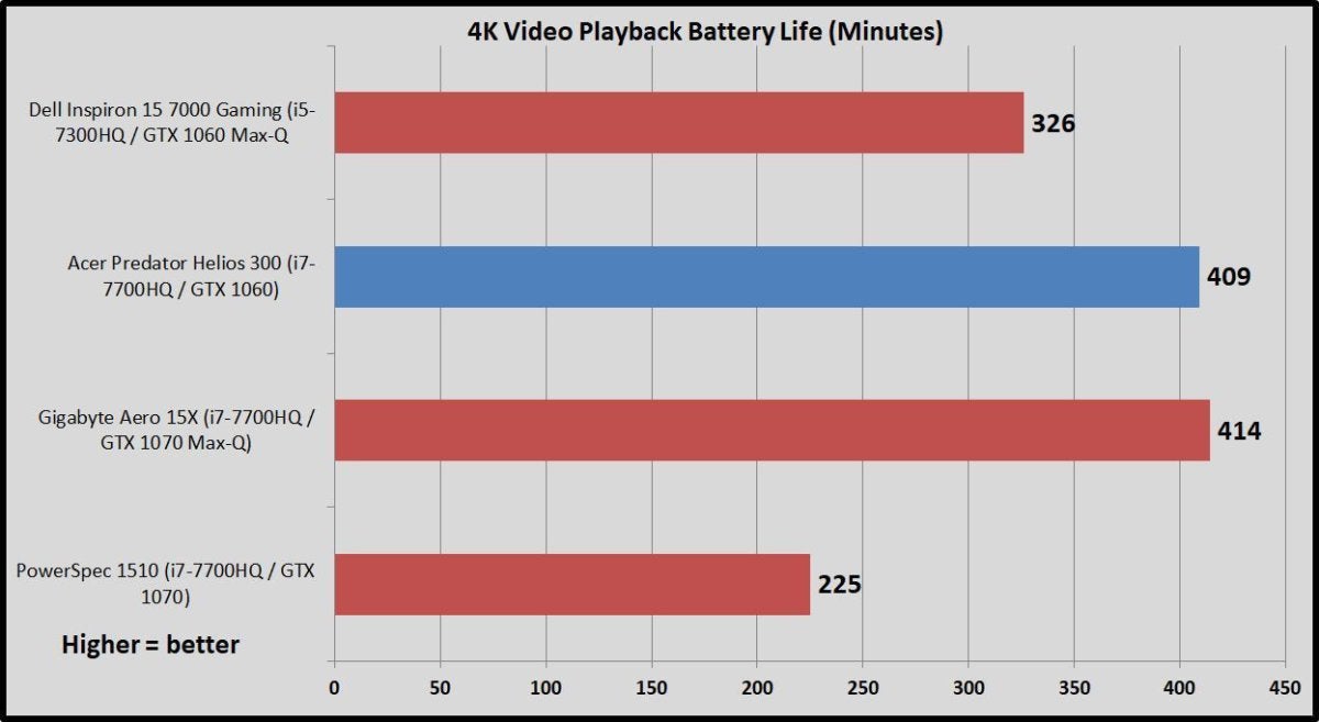
Acer’s notebook offers strong endurance for a gaming laptop, clocking in at nearly 7 hours in PCWorld’s battery run-down test, which consists of looping a 4K video in the Windows 10 Movies and TV player with audio at 50 percent until the machine gives up the ghost. That’s comparable with the Gigabyte Aero 15X, a laptop we praised for its battery life.
Two factors play strongly into the result. First, the Helios 300 does not include a G-Sync display, so it’s able to switch to the integrated graphics in the Intel CPU to save energy when you’re not gaming. The screen’s dim compared to its rivals, too. We standardize our battery life results by setting laptop brightness to 250 nits, a comfortable level for indoor viewing. Acer’s laptop maxes out at 230 nits. That skews the results in this benchmark—though it also means that the Predator genuinely lasts longer out in the real world.

Should you buy the Helios 300?

The screen isn’t dark enough to dissuade, though, and it’s the only semi-issue of note in the Acer Predator Helios 300. This is a great notebook.
acer predator helios 300 1
You don’t see gaming laptops this well-rounded going at such a competitive price very often. Acer loaded the Helios 300 with more potent hardware than usual for this cost tier, paired it with a comfortable keyboard and touchpad combo, then pulled it all together into a fairly portable package that won’t break your back.
[ Further reading: Best gaming laptops: Know what to look for and which models rate highest ]
As far as alternatives go, the PowerSpec 15 moves up to a full-fat GTX 1070, a G-Sync display, and a supplementary 1TB hard drive for only $200 more. That’s a hell of a deal too, but it makes some compromises to hit that price. It’s a big, heavy, ugly laptop that’s only available in-store at Micro Center, plus you need to jump through arcane hoops to activate G-Sync (which nukes the laptop’s battery life). The $900 Dell Inspiron 15 7000 is another option, but it uses a lesser-powered CPU and GPU to hit its sub-$1,000 price point. The GTX 1050 Ti inside will run most games at 1080p, but not at maxed-out graphics options, and it's not very future-proof.
This comfy-to-carry notebook delivers a superb 1080p gaming experience and absolutely oozes value. If I needed to buy a gaming laptop today, the Acer Predator Helios 300 would get my money (though I’d augment its paltry 256GB of storage with another SSD or external drive). Highly recommended.


الخميس، 7 يونيو 2018

Nokia 6 (2018) review

It’s been a minute since Nokia came bounding back onto the global smartphone stage with its HMD-backed, impressively inexpensive Androids. Now we’re getting into the second editions, which is where we’ll see how much attention Nokia paid to the first round reviews, and get an idea of how their phones will stack up in the long term.
In this case, the original Nokia 6 got a strong 4-star review with some caveats - notably the slow charging and average hardware.

When the 2018 revamp was announced, there was a lot of excitement among Android purists about the updated design, upgraded chipset and addition of fast charging. The price has had a little bump too.
Before we get into whether it’s worth the extra spend, it’s worth mentioning that there’s some confusion around the name of this phone. The company itself calls it ‘the new Nokia 6’ in some places, and ‘Nokia 6.1’ in others, including on the box.
We’ll be using both in this review, but it’s useful to know because the Nokia 6 (2017) is still out there, and you’ll want to double check you’re buying the newer handset before you pull the trigger.

Nokia 6 (2018) price and availability

The new Nokia 6 price is $269 (£229, RS 16,999 about AU$420), which is slightly more than the launch price of its predecessor ($229, £200, AU$399).
It's available from retailers in the US, UK and India and will be coming to Australia in more regions soon.

Design and display

  • Classy aluminum design with eye-catching accent colors
  • Generous 1080p screen with glossy finish
  • Weighty and not the most comfortable to hold
In true Nokia style, this phone is built like a tank. The 148.8 x 75.8 x 8.6mm (including camera bump) unibody is made from 6000-series aluminum with flat diamond-cut sides, rounded corners and a highlight color on the outlines.
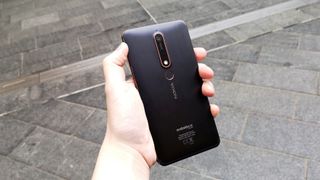
Our review model is the Black/Copper colorway, which is an innovative way to make yet another black rectangle look different - and classier - than its competition.
There’s also a gorgeous deep blue option with gold accents, and White/Iron, which is a pale silver with metallic reddish accents rather than the deep grey you might expect from the name - presumably we’re talking about oxidized iron, aka rust.
Between the all-metal body and the thickness of the handset, this is a weighty piece of tech at 172g and feels reassuringly like it could handle modern life without being cosseted in a case.
That said, after a couple of weeks of use and several drops, we have noticed a few small dings in the edges, so you might want to case it up anyway if you’re a perfectionist about that kind of thing.
Speaking of drops, the Gorilla Glass 3-covered screen is also built to last, sustaining no damage from our butter-finger tendencies (note: not a guarantee).
However, with its incredibly glossy, slightly rounded design, it does make the phone liable to fall straight off your desk if you put it face-down. Face-up it’s fine and has plenty of grip, but if you’re one of those people who flips your phone over for meetings, it might be better off in a pocket.
It’ll have to be a big pocket, though: the 5.5-inch screen and relative thickness at 8.6mm means this isn’t one of the sleeker phones on the market.
That means it’s not the comfiest to hold in your hand, either: smaller-pawed humans might well find it uncomfortable for long stretches, and it’s ridiculously easy to entirely muffle the solo downward-firing speaker on the bottom left with the heel of your hand.
Assuming you’re on board with the chunky aesthetic, the Nokia 6 (2018) is an impressively good-looking piece of kit considering its price point.
The anodized back panel includes a long Zeiss-branded camera and flash opening, which protrudes a little. Below that is the fingerprint scanner, also ringed in the accent color, and past that is the sideways silver Nokia logo. That’s it for the back except for the Android One logo.
The face of the phone is similarly minimalist, relying on that super-glossy screen and the accent color to stand out, which it absolutely does.
There’s a small Nokia logo on the top right of the fairly large (for 2018) bezel, and there’s a thick black chin below the screen. This serves no obvious purpose as the fingerprint key is on the back and the nav buttons are software, but we can’t ask too much at the budget end of the market.
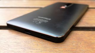
The left edge holds the SIM tray, there’s a proper headphone jack on the top right of the top edge, accented volume rocker and power key on the right edge, and a centered USB-C charging port on the bottom next to that left-mounted speaker.
Our only complaint about this layout is that it’s quite easy to miss the fingerprint pad by touch and smudge up the flash unit just above it. That said, at least you’re not putting your fingerprints all over the camera lens as with some phones.
You will, however, get your fingerprints all over the glossy screen and the aluminum back panel.
The 5.5-inch 16:9 screen in particular is very smudgy, but it’s much less noticeable when the display is powered on.
It’s a lovely-looking screen, bright and sharp, and while of course it can’t compare to the pixel-packed displays of the top-end devices, it does offer a full HD (1080 x 1920, 403ppi) experience in a much less expensive package. As long as you don’t hold it next to a Samsung Galaxy S9, you should be happy.

iPhone 8 Plus review

Apple's making it harder and harder to review the iPhone every year. Once again, the iPhone 8 and iPhone 8 Plus are incredibly iterative.
 [Update: Apple has added a new iPhone 8 Plus color, and we've opined about that below. Also, thinking about buying? Then make sure you check out our iPhone 8 Plus deals to ensure you're getting the best offer.] 

iPhone 8 Plus specs

Weight: 202g
Dimensions: 158.4 x 78.1 x 7.5mm
OS: iOS 11
Screen size: 5.5-inch
Resolution: 1080 x 1920
CPU: Apple A11 Bionic
RAM: 3GB
Storage: 64/256GB
Battery: 2,691mAh
Rear camera: Dual 12MP
Front camera: 7MP
The iPhone 8 Plus looks like the iPhone 7 Plus, which looks like the 6S Plus, which looks like the 6 Plus. The only thing that marks out the newer model visually is the addition of the glass back and the two-tone effect it creates… if it wasn't for that, it would be impossible to tell this and the 7 Plus apart.
That said, maybe this is more of a statement about the state of the industry. Apple has never changed things for the sake of it, and with  the 8 Plus it feels like Apple saying there's nothing truly fundamental out there to move to.
Except… we also have the iPhone X, which does move the dial dramatically, plug in reams of new technology and alter the way we think about the iPhone.
So one can only surmise that this is the 'default' iPhone – the one that the people not willing to spend exorbitant sums of money on a handset, or not keen on big changes, will look to when buying a new iPhone
Despite not being in the X's price bracket, however, the iPhone 8 Plus is still one of the most expensive flagship phones on the market, even well into 2018. So it needs to have something a little different to command interest over the previous models.
There are some strong upgrades: the camera has been enhanced, the internal workings are now among the most powerful in the industry, and little tweaks throughout smooth off rough edges in a way that makes us feel Sir Jony Ive climbed inside his computer and lathed them off himself.
Add to that a better battery and screen, and the iPhone 8 Plus is the better iPhone compared to the smaller 8.
But today's smartphone user is getting more discerning, and holding onto their handsets for longer than ever before… so the new phablet from Apple needs to deliver.

iPhone 8 Plus vs iPhone X

The first difference here is cost - although not to the same level as vs the iPhone 8. The iPhone X starts at $999 / £999 / AU$1,579 if you want the 64GB model, where the iPhone 8 Plus begins at $799 / £799 / AU$1,229 for the same capacity.
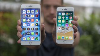
So what are you getting for that (slightly) higher cost? Primarily, the screen - you've got a bezel-less 5.8-inch display with a 1,125 x 2,436 resolution, and it's OLED display technology too - that's superior to the 5.2-inch  1,080 x 1,920  screen on the iPhone 8.
That's a larger phone with a smaller screen - that's what losing the bezel brings.
The other big difference to consider is how you unlock this phone - with the iPhone 8 Plus, it's Touch ID fingerprint scanning, as it has been for years. With the iPhone X, you're unlocking with your face, using the nattily-named Face ID.
We are worried about whether Face ID will be swift and recognise faces fast enough - this will be one of the key things we look at in our review of the iPhone X when it lands.
The notch at the top of the iPhone X contains a camera that allows for Animoji, where emoji can be animated by mapping your face - this feature is locked to the iPhone X, and isn't a feature that appears on the iPhone 8 Plus or iPhone 8.
Both the iPhone X and iPhone 8 Plus have dual cameras , which allows for background de-focus and a more comprehensive photographic experience - however, due to the way the phones are packaged (to accommodate for the iPhone X notch) the camera array is horizontal on the X, but vertical on the 8 Plus.
Basically, the iPhone 8 Plus is the larger-screened version of the 8, with better battery and more heft.
The iPhone X is the next generation of Apple's phone. It's chock-full of new technology, it's exciting for Apple fans, but it's untested and expensive. Our full iPhone X review is incoming... so if you wanted to really find out which is best, we'd recommend waiting a few days.

iPhone 8 Plus price and release date

  • Launch price (64GB): $799 / £799 / AU$1,229
  • Launch price (256GB): $949 / £949 / AU$1,479
  • Launched September 22, 2017
It’s probably no surprise to you, but the iPhone 8 Plus price is high – if you're going for the 64GB model it's $799 / £799 / AU$1,229, while the 256GB option comes in at $949 / £949 / AU$1,479.
There really needs to be a middle ground option for those who want to stick a few high-power apps on there, record a fair amount of video and download reams of music – that's where a 128GB model would have fitted in nicely.
The average user might struggle to fill the 64GB variant with photos, apps and music, and it’s good to see that Apple is starting to get back ahead of how much storage most people need.
However, given that the iPhone 8 Plus can record in 4K at 60fps, and three minutes of that comes in at  2.16GB, if you're going to do much filming at that quality you’ll fill the 64GB variant fairly easily.
Shop around though, and you'll find that the iPhone 8 Plus can be had for less. In the UK for example, we've found it at £759. It's not a huge saving, but every little helps.
Of course, opting to get the iPhone 8 Plus on contract will reduce the upfront cost, but it will increase your monthly outlay.
The iPhone 8 Plus release date was September 22 – so if you're looking to get your hands on one, you can do now from a number of big retailers and networks.

Glistening gold back offers new powers

  • Glass back allows for wireless charging
  • Looks luxurious in gold
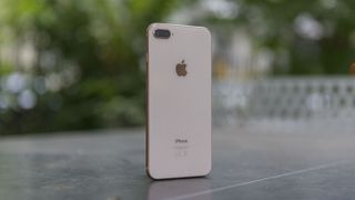
The main thing you’ll notice about the iPhone 8 Plus from an aesthetic point of view is the outer coloring. The new gold version is the main event, with a gold aluminum rim and a gold/white glass back mixing together.
It’s a striking combination, and compared to the 7 Plus is really rather visually different, creating a more luxurious effect. Also alluring are the special edition Product Red iPhone 8 and 8 Plus phones that exhibit a deep red for mid-cycle freshness.
The silver and space gray colors don’t quite have the same visual punch, but in the hand those phones still feel different with the glass back.
The reason for the glass back isn’t primarily aesthetic, though. Apple has finally jumped on the wireless charging bandwagon, just when it looked like it might be losing steam. Samsung has been the main promoter of the technology for the last couple of years, and now that Apple’s on board wireless charging is very likely to become mainstream.
There’s no denying it’s convenient, as popping your iPhone down on a charging pad is so much simpler than connecting and disconnecting a cable. But it’s hardly revolutionary – the tech has been baked into phones for years.
It would, perhaps, be more impactful here if there was a wireless charging pad in the box, but you’ll need to spend $59.95 / £54.95 / AU$99.95 to buy one from Mophie or Belkin right now, with Apple’s own AirPower pad coming later this year.
The speed of charging is impressive though, as it’s not too far off that of a wired connection. We can still remember the trickle charge you used to get with wireless, so you can see why Apple waited until the experience was good enough to put it in its handsets.

New Portrait Lighting mode

  • Portrait mode is faster and better than before
  • Portrait Lighting is a small but impressive new feature
The headline feature of the 12MP dual sensor on the rear camera is the enhanced bokeh mode – dubbed Portrait Lighting.
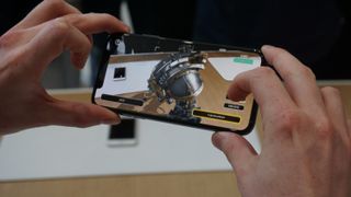
The abilities here are pretty astounding, and show how powerful the new A11 Bionic is inside – being able to algorithmically work out the contours of the face and change the lighting dynamically is impressive.
This can be done either while the picture is being taken or after, via the gallery – although while it’s a powerful tool, it’s not one that really impressed anyone we showed it to.
And that’s kind of indicative of the iPhone 8 Plus as a whole – while the overall experience is smoothed and enhanced, the headline features aren’t really there. Portrait Lighting is, well, fine – and we almost feel guilty for not evangelizing about it more, given how much intelligence has gone into creating it.
But taking a Portrait mode picture takes some setting up as it is – so achieving the level of quality where Portrait Lighting makes a big difference to the outcome is rare.
However, the new Portrait mode is one of the places where the iPhone 8 Plus is a significant upgrade over its predecessor – it’s brighter, faster to recognize the object you’re trying to snap, and it’s also got that Portrait Lighting feature, which isn’t coming to the older model.
The Portrait Lighting modes change things slightly, but nothing mega – and the Studio and Studio Mono modes look a little too cut-out, despite the edge detection being really accurate.
If you spend some time setting up a subject to take the perfect photo, you can get some decent results – but modern smartphone cameras need to take a brilliant quick snap, and we can see this feature being shunted off to the ‘rarely used’ section of your phone.

A11 Bionic engine

  • Brilliant benchmark results
  • Doesn't seem speedier in practice than 7 Plus or Note 8
It’s hard not to like the names Apple is appending to its chips these days. Following A10 Fusion, A11 Bionic doesn’t really make a lot of sense in terms of what it actually does, but it’s evocative.
Anyway – that’s that dealt with. The new chipset inside has six cores, with four efficient ones doing the basic stuff and the other two doing the heavy lifting, whether that’s photo-editing, intensive multi-tasking or providing real-time camera effects.
Those previously mentioned Portrait Lighting effects need some real power, and that’s where the A11 chip comes in. Any app that uses high levels of photo manipulation worked pretty flawlessly in our tests, with no lag when working with multiple image layers.
It’s hard to convey the usefulness of all this power for the average user, one who might not use such features regularly – but it’ll keep your iPhone singing more sweetly for the next two or three years compared to the previous generations.
Everything feels fast under the finger – although that seems like a redundant thing to say given that most iPhones feel that way when taken out of the box. The real test comes when you start loading it up with apps and content.
This is one of the most powerful phones out there
Generally, even when loaded up the iPhone was zippy as anything, with nothing flickering under the finger. However, we had a few moments where the interface juddered and bounced a bit – it still moved swiftly, but the frame rate slowed so it looked jagged.
It righted itself quickly, but it was surprising to note for an iPhone – it’s not something we’re used to.
What’s more surprising is that the iPhone 8 Plus didn’t perform any better in testing than the iPhone 7 Plus – we opened and closed apps on the two phones simultaneously, and the response times were identical - and was similar in performance to the Samsung Galaxy Note 8.
In fact, when saving a large video to Files, the iPhone 7 Plus was actually faster at completing the task, despite being older and having more storage taken up. The A11 Bionic chip is certainly powerful, but we’ve not seen anything that shows off the raw power in terms of regular interaction – it’s only evident in extra features like the Portrait Lighting.
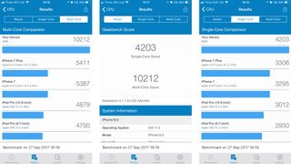
In terms of out-and-out power though, this is the most powerful phone we’ve ever benchmarked. The Geekbench results are off the chart, powering past 10,000 for the multi-core score and easily beating anything from the Android world.
Will you notice the power of the iPhone in day-to-day use? Nope. iPhones have been rapid enough for years – but people are starting to expect even more and more from their device, whether that’s adding filters to photos, exporting content to friends, or playing the most powerful games around, and you’ll be glad of the bionic chip in a year’s time.
Apple doesn’t make a song and dance about the raw power in its devices, but it does build its reputation on phones just working as they should, and the iPhone 8 Plus will carry on working as it should longer than any phone Apple’s selling right now